
Mastering Excel Trendlines: A Comprehensive Guide
Understanding how to add a trendline in Excel is crucial for anyone working with data analysis. Whether youre predicting future sales, analyzing market trends, or simply visualizing data patterns, trendlines provide invaluable insights. This comprehensive guide will walk you through various aspects of creating and interpreting trendlines in Excel, addressing common questions like how to add a trendline in excel chart, how to add a trendline in excel mac, and how to customize your trendlines to best suit your needs. Well cover everything from the basic steps of adding a trendline to more advanced techniques, ensuring you gain a complete understanding of this powerful Excel feature. We'll even tackle those frustrating moments where you might wonder, why is trendline greyed out in excel? This guide aims to equip you with the knowledge to confidently utilize trendlines in your data analysis.
Table
Adding Trendlines to Your Excel Charts: A Step-by-Step Guide
Learning how to add a trendline in excel is surprisingly straightforward. The process is similar across different Excel versions, including Excel for Mac and Excel Online. First, you need a chart with your data. This could be a scatter plot, a line chart, or any other chart type suitable for visualizing your datas trends. To add a trendline, simply select the data series within the chart. Then, right-click and select Add Trendline. This will open a panel where you can customize your trendline. You can choose from various trendline types, including linear, exponential, logarithmic, polynomial, and moving average. The best choice depends on the nature of your data and what youre trying to demonstrate. For instance, if your data shows a steady, consistent increase or decrease, a linear trendline (how to add a linear trendline in excel) would be suitable. If the growth accelerates over time, an exponential trendline might be more appropriate (how to add a curved trendline in excel). This is where understanding how does excel calculate trendline becomes vital for accurate interpretation.
Choosing the Right Trendline Type
Selecting the appropriate trendline type is key to accurate data interpretation. How does excel calculate linear trendline? Excel uses least squares regression to fit the trendline to your data. For a linear trendline, the equation is in the form y = mx + c, where m represents the slope and c is the y-intercept. How to add a logarithmic trendline on excel is similar but uses a logarithmic function, ideal for data that grows slowly initially, then increases at an increasing rate. A polynomial trendline (how to add a polynomial trendline in excel), on the other hand, is a higher-order curve, fitting more complex relationships. How to add a custom trendline in excel is not directly an option but selecting the best-fitting type provides the optimal customisation, considering how does excel calculate trendline, making the right choice crucial for your specific data.
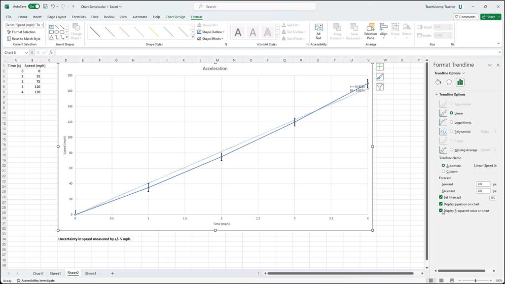
Displaying the Trendline Equation and R-squared Value
Once youve added your trendline, its crucial to display the equation and R-squared value. This information is vital for understanding the trendline's significance. The equation (how to add equation to trendline in excel) reveals the mathematical relationship between your variables, allowing you to predict future values. The R-squared value (how to find trend line equation in excel) indicates how well the trendline fits your data—a value closer to 1 implies a stronger fit. Knowing how to display the equation of a trendline in excel is crucial. To do this, simply check the Display Equation on chart and Display R-squared value on chart options within the trendline settings. This is a critical step in any data analysis that uses trendlines.
Adding Multiple Trendlines to a Single Chart
In some cases, you may need to add multiple trendlines to a single chart for comparison. How to add 2 trendlines in excel, or even more, involves repeating the steps above for each data series. This helps to visualize the differences in trends between different datasets, potentially revealing interesting insights. For instance, comparing sales figures of different products on the same chart allows you to easily see which products are performing better, highlighting the power of using more than one trendline (how to add more than one trendline in excel). Remember to clearly label each trendline to avoid confusion, using the legend or annotations if necessary.
Troubleshooting: Why is Trendline Greyed Out in Excel?
Sometimes you might encounter the frustrating issue where the Add Trendline option appears greyed out. Why is trendline greyed out in excel? This usually occurs if the data series you selected doesn't have sufficient data points for Excel to accurately calculate a trendline. The solution involves selecting a data set large enough for Excel to calculate trendlines effectively. This often means checking your dataset for sufficient points and possibly refining the data to include relevant series.
Advanced Trendline Techniques in Excel
Beyond the basics, Excel offers advanced features for refining your trendlines. This section explores techniques for customizing trendlines, handling outliers, and extracting specific information from the trendline equation. How to add a custom trendline in excel isn’t a direct option but involves careful selection of the appropriate trendline type combined with additional data manipulation to optimise visual representation.
Customizing Trendline Appearance
You can customize the appearance of your trendlines to improve readability and visual appeal. How to add trend arrows in excel isnt a direct function. However, you can alter the trendlines color, style, and thickness to make it stand out or blend seamlessly with your chart's design. These customizations enhance the overall clarity and professionalism of your data visualization. These options are readily available in the trendline settings menu after adding a trendline.
Extrapolating Trendlines for Future Predictions
One of the most powerful uses of trendlines is to extrapolate them beyond your existing data. How to extrapolate a trendline in excel involves adjusting the trendlines forecast range in the trendline settings. This allows you to predict future values based on the established trend. However, its crucial to remember that these predictions are based on past patterns and may not always be accurate. Extrapolating too far beyond the available data can lead to unreliable predictions. Therefore, caution and careful consideration are important aspects of using this feature.
Finding the Slope and Intercept of the Trendline
The trendline equation provides the slope and y-intercept. However, how to find slope of trendline in excel, or its y-intercept, also involves extracting information from the displayed equation or using the FORECAST or SLOPE functions of Excel to obtain precise values. These functions provide more flexibility and precision to your analysis. Knowing how to find the equation of a trendline in excel is therefore an essential skill.
Handling Outliers and Data Cleaning
Outliers—data points significantly different from the rest—can skew the trendline. How to exclude data points from trendline in excel is not a direct feature; however, you can address this issue by either removing the outliers from your dataset or using techniques like robust regression (not directly available in Excel's trendline options). Data cleaning before creating a trendline often improves its accuracy and reflects the true patterns within your data more effectively. A well-cleaned dataset is the cornerstone of effective trendline analysis.
Trendlines Across Different Excel Platforms and Chart Types
This section clarifies how to apply the trendline features across different platforms and chart types within Excel. It clarifies the consistency of the process and highlights any platform-specific considerations.
Adding Trendlines in Excel for Mac and Excel Online
How to add a trendline in excel mac is virtually identical to the Windows version. The steps, options, and customizations are consistent across platforms. Similarly, how to add a trendline in excel online mirrors the desktop versions, providing consistent functionality regardless of your operating system or access method. How to add a trendline in excel online mac uses the same interface and functions as other versions.
Trendlines in Different Chart Types
How to add a trend line to excel chart applies across various chart types, but the suitability varies. While scatter plots are best for trendlines, other charts, such as line charts, can also use trendlines effectively. However, understanding the type of trendline most suitable for each chart type is essential for effective data interpretation and visualization. For instance, a line chart may not suit all trendline types as effectively as a scatter plot.
Adding Trendlines to Scatter Plots
How to add trend line to scatter plot in excel is particularly useful for analyzing relationships between two variables. Scatter plots visualize the relationship between your data points, and a trendline highlights the overall trend or correlation. This combination offers a powerful way to analyze and interpret relationships in your data. Scatter plots offer the greatest versatility when using trendlines.
Mastering the art of adding and interpreting trendlines in Excel empowers you to extract meaningful insights from your data. From choosing the appropriate trendline type to customizing its appearance and handling outliers, this guide provides a thorough understanding of this crucial Excel feature. By utilizing these techniques effectively, you can significantly enhance your data analysis capabilities and confidently communicate your findings.
This video might interest you: give it a watch
Mastering Date Sorting and Management in Microsoft Excel

Mastering Excel Filtering: A Comprehensive Guide to Data Management

Mastering Hyperlinks in Excel: A Comprehensive Guide

Recover Lost or Corrupted Excel Files: A Comprehensive Guide

Mastering Excel File Size Reduction: Practical Strategies for Smaller, Faster Spreadsheets

Mastering Watermarks in Excel: A Comprehensive Guide
Leave a Reply
Contenido relacionado