
Mastering Line Plots and Data Manipulation in Microsoft Excel
Microsoft Excel, a ubiquitous tool in offices across Australia, offers a surprisingly diverse range of functionalities beyond basic spreadsheets. This comprehensive guide will explore the creation of line plots, a powerful visual representation of data trends, within Excel. Well cover not just the basics of plotting data but also delve into related tasks such as managing lines, printing effectively, and even incorporating more advanced statistical elements like bell curves and linear regressions. Whether youre aiming to create a simple line plot to showcase sales figures or a complex statistical model, this guide provides the knowledge to achieve your goal. Understanding these techniques can significantly enhance your data analysis and presentation skills, ultimately boosting productivity and informed decision-making.
Table
Creating Your First Line Plot in Excel: A Step-by-Step Guide
Learning how to make a line plot in excel is fundamental for effective data visualization. First, ensure your data is organised correctly – each data series should be in a separate column, with the corresponding x-values (categories or time periods) in another column. This organization is crucial for accurate plot creation. For instance, if you're tracking monthly sales, one column will list the months, while the others will contain sales figures for different product categories. Once prepared, select your data range, including the x-values and the data you wish to plot. Then, navigate to the Insert tab, locate the Charts section, and select the line chart icon. Excel automatically generates a basic line plot; however, you can customize its appearance by altering colours, adding labels, adjusting axis scales, and more.
Selecting and Preparing Your Data for Accurate Line Plots
Before you even begin thinking about how to make a line plot in excel, effective data preparation is key. Inaccurate or poorly organized data will lead to misleading visualizations. Ensure data cleanliness is prioritised, removing any inconsistencies, errors, or duplicates. This step ensures a smooth process of how to put lines in excel and prevents the creation of inaccurate visual representations of your data. Remember to check for outliers – data points significantly different from the rest of the dataset – as these can skew the line plot. You might need to investigate why they exist before proceeding.
Customizing the Appearance of Your Line Plot
Once you've created your basic line plot, the real work of customization begins. Excel provides a range of options to enhance clarity and impact. You can easily alter the colors of the lines to improve visual distinction, making it easier to identify different data series. Using consistent and appropriately contrasting colours is important, especially if your line plot includes many data points. Consider also adding clear axis labels and a title to improve comprehensibility, further facilitating understanding of your data. These are essential steps in mastering the art of how to make a line plot in excel.
Adding Data Labels and Legends for Improved Clarity
Adding data labels to your plot enhances its readability, particularly when dealing with many data points. Data labels are small text boxes directly on the plot, identifying the actual values of each data point. This is an important feature as it allows viewers to quickly grasp the magnitude of the data without having to refer to the raw spreadsheet. Similarly, a well-placed legend is crucial for making sense of lines if you have more than one data set. It helps in immediately identifying which line represents which set of data, further refining your understanding of how to make a line plot in excel.
Working with Multiple Data Series on a Single Plot
A single line plot can effectively present several different data series. This is a valuable method of comparing related data trends. For example, when comparing sales across various product lines over a specific period, each product line can be represented by a different colour line on the same plot. This allows for easy visual comparison and allows quick identification of top and bottom performers. Knowing how to put a line in excel is vital, but understanding how to manage multiple lines effectively enhances the value of your charts.
Advanced Line Plot Techniques and Data Manipulation
Beyond basic line plots, Excel facilitates more complex data visualization and analysis. This section explores how to incorporate advanced features and manipulation methods to enhance the informative value of your data visualization. We will cover techniques such as adding trend lines, fitting regression models, and dealing with various data types. These techniques ensure you derive the maximum value from your data, transforming spreadsheets into informative reports and visual analysis tools.
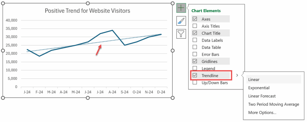
Adding Trendlines and Regression Lines to Your Line Plot
Trendlines and regression lines provide insight into underlying patterns in your data. A trendline simply shows the overall direction of the data, while a regression line shows the best linear fit for the data according to a statistical model, offering a quantitative understanding of the relationship between variables. Knowing how to do linear regression in excel is highly valuable for data analysis and prediction. To add a trendline, right-click a data series on your chart and select Add Trendline. You can then customize the trendline type (linear, exponential, polynomial, etc.) based on the nature of your data. A regression analysis can give you the equation of the line of best fit, providing powerful predictive capabilities.
Creating Bell Curves (Normal Distributions) in Excel
Understanding how to create a bell curve in excel is crucial when dealing with normally distributed data. Many statistical concepts and analyses are built upon the bell curve – a visual representation of the normal distribution, showing the frequency of data points around a mean. This curve helps visualize the spread and central tendency of your data. The creation involves using the NORMDIST function, which calculates the probability density for a given value in a normal distribution, providing the data to plot the curve. By using this function with different values and plotting them against the data, you can visually represent the normal distribution.
Handling Different Data Types and Customizing Chart Elements
Excel's charting capabilities extend to numerous data types, not just numerical values. You can create line plots using dates, text labels, or even combined data types. Customizing chart elements such as axis titles, legend placement, gridlines, and data markers increases the clarity and aesthetic appeal of your visual representations. How to get the lines to print on excel correctly requires careful attention to these elements. Ensuring your chart is easily understandable and visually appealing is key to successful data communication.
Integrating Advanced Statistical Functions for Complex Analysis
Excel's built-in statistical functions extend your data analysis capabilities significantly. You can use these functions to calculate various statistical measures before creating line plots or to directly generate values for use in more advanced analysis, providing deeper data interpretation. Knowing how to use excel for linear regression, for instance, is critical to this step. From calculating correlation coefficients to performing more complex regression models, Excel provides tools for in-depth data analysis, allowing accurate interpretation of your line plots.
Printing and Exporting Your Line Plots: Best Practices
Once your line plot is complete, you will want to print or export it for sharing and presentation. This section explores the essential techniques to ensure that your charts are printed clearly and accurately, free of unwanted elements and distortion. We’ll also cover techniques for managing gridlines, printing ranges, and the proper export settings to maintain the visual quality of your work.
Ensuring Clear and Accurate Printing of Your Line Plots
Successfully printing excel with lines requires careful attention to several settings. Before printing, preview your chart to check the layout and ensure all elements are visible and clearly legible. Sometimes it can be hard to know how do you print excel with lines. You can adjust the page margins, orientation, and scaling to optimise the output for your printer. Consider printing in high resolution to maintain clarity. Also pay attention to the printer settings – sometimes printer drivers have settings that can obscure or affect the appearance of lines.
Managing Gridlines and Other Chart Elements for Optimal Output
Understanding how to print excel gridlines is essential. Gridlines can aid in reading charts, especially those with dense data. However, they may not be necessary or may clutter the chart when printed. You have the option to show or hide gridlines, or change their appearance. How do I print the lines in excel is also important to consider, as not all lines might need to print. To properly manage lines before printing, go to the Page Layout tab. This allows the choice between including or excluding gridlines when printing. If you need to change the appearance of gridlines for better visibility, you can adjust their colour and weight.
Exporting Your Line Plots for Use in Presentations and Reports
Exporting your charts in a suitable image format is often essential for inclusion in presentations or reports. Excel supports various image formats, including PNG, JPG, and GIF. Choosing the appropriate format depends on the intended use and desired level of quality. Consider using a high-resolution format like PNG for print use, as this will maintain detail and clarity. When exporting your charts, make sure to include any relevant details to further clarify your data representation. It is important to note when exporting that not all formats support transparency and so you might need to adjust colours and backgrounds. Understanding how to print excel with lines is just the first step, effective export is also paramount.
Troubleshooting Common Printing Issues
Occasionally, you might encounter problems while printing your line plots. Issues may include missing lines, distorted elements, or incorrect scaling. Check your print settings, ensuring that you have selected the correct printer and that the printer driver settings do not interfere with your data visualization. Try different print settings or even print to a PDF first to see if the problem lies in the printer or excel itself. This process may be necessary when you are struggling with how to get lines to print in excel.
Mastering the art of creating and managing line plots in Excel is a valuable skill for anyone working with data. By following these steps and understanding the advanced features and techniques presented, you can create compelling visuals to effectively communicate your data insights. Whether it's creating a simple line chart to represent sales data or an advanced model for complex analysis, the power of line plotting in Excel is incredibly versatile and impactful in daily work within Australian businesses. Remember to always prioritize data clarity and accuracy when creating charts, ensuring that your visualizations accurately and effectively convey information.
This video might interest you: give it a watch
Mastering Excel Links: A Comprehensive Guide to Linking and Managing Data

Mastering Page Breaks and Layout in Microsoft Excel: A Comprehensive Guide

Mastering Bullet Points in Microsoft Excel: A Comprehensive Guide

Mastering Date Sorting and Management in Microsoft Excel

Mastering Excel Filtering: A Comprehensive Guide to Data Management

Mastering Hyperlinks in Excel: A Comprehensive Guide
Leave a Reply
Contenido relacionado